

Making of MediaGoblin "Rise of the RoboGoblins" release artwork
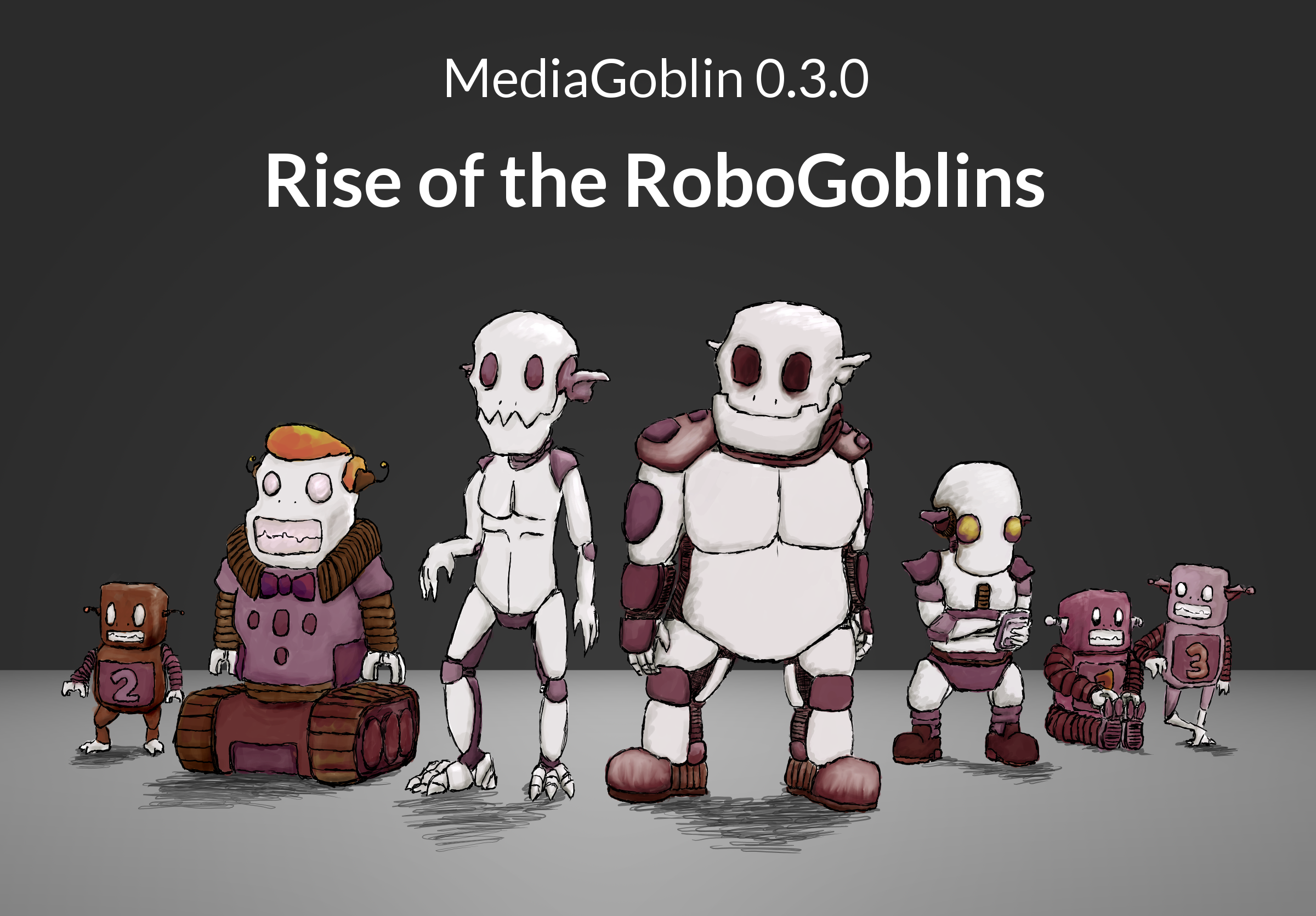
We just made another release of GNU MediaGoblin: 0.3.0, "Rise of the RoboGoblins"! We've had "release artwork" for a while, ever since Jef van Schendel made the banner for our 0.0.3, "Talking in Rainbows" release, but recently I've been doing the artwork. The last few releases have come out with release artwork that is both more complex than my usual work, but also with results that I'm extremely proud of. In a certain sense, it's silly to spend so much time on release artwork. Sure, people seem to like it. But on the other hand, I probably could be coding. But my life has also been both at work and in hobby space more and more of "hacker management" work (as in, both doing programming as a hacker and managing projects that hackers work on) and it's nice to get some time in to do artwork for fun.
Anyway, several people have commented that they really like the artwork for this release, I've been meaning to write up a blogpost showing how I do artwork, and there are a couple of interesting aspects to the artwork in this release, so now seems like an opportune time to give a brief overview of the process.
First of all, materials. Excepting a minor bit of Blender assistance, I did everything in the GIMP for this release. I have an Intuos 2 wacom tablet that I use on my desktop, and I've used that as my primary art tool for almost a decade(!) now, but earlier this year I got a Thinkpad X220 laptop/tablet hybrid (with gorilla glass screen for scratch resistance while drawing; definitely recommended if you do much artwork on the go) and I do almost all my artwork on there these days. In fact, most of the artwork for this release was done from the car (Morgan was driving, of course).
I knew I wanted to go with the name "Rise of the RoboGoblins" for this release, both because I thought it fit in a very silly and abstract way, and because I knew I had some ideas for artwork that could go with it. I didn't have extremely specific ideas for the artwork, just that I wanted a group of robot goblins bravely standing around. So first step, figure out what those robots look like.
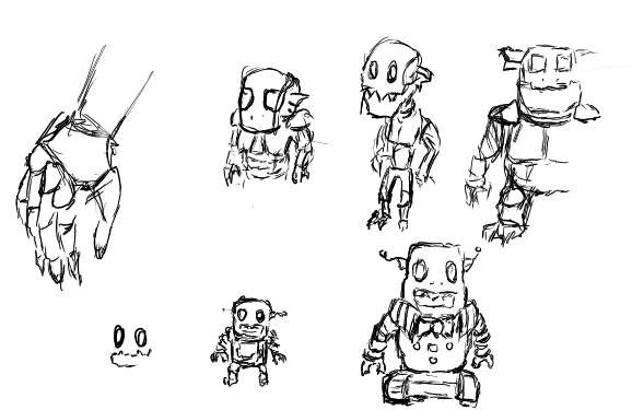
This is typically what my canvas looks like when I'm sketching out ideas. When I sketch for ideas I usually do a bunch of small drawings on a moderate/smallish canvas resolution. Fast and loose sketches, see what sticks. In this case, as I came up with robot designed I liked I moved them over to the side. I usually don't bother to clean up files like this very much. I use the pen tool for this, as I do for pretty much all my sketching and outlining.
Now that I knew what the characters looked like, I wanted to figure out where to place them. I had a pretty good idea of the character sizes based off of thinking bout the character sketches above, so I did a quick and rough sketch of things in an 800x600 canvas.
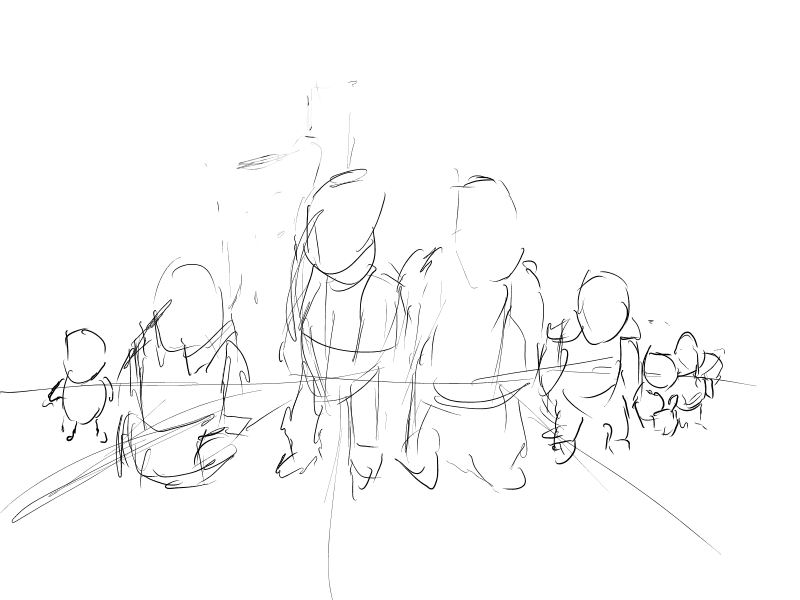
This looked pretty good to me, and I had a pretty decent sense of the composition and perspective. Yes, on its own, the above sketch looks like crap. But it isn't meant to be evaluated on its own; it's just a guide for me and me alone.
There's only one problem: I'm terrible at perspective. Or, that is, I can do perspective when it's just one object, but the moment I start to put a bunch of objects in a scene I start overworrying about the structure of perspective and tend to overcompensate. Luckily, I had a trick up my sleeve that I used in our previous release, 0.2.1, "Gearing Up":
Basically, taking a cue from the wonderful Blend & Paint training DVD, I made a minimal scene in Blender to figure out the perspective, then used that as a background layer to guide me in the shapes and perspective of my artwork. (Thanks to my good friend Lunpa for suggesting this technique probably would work with my artwork as well.) As you can see, the shapes are super, super basic in the blender scene. I don't need anything complex, I just need to know where things are. So, by that same principle, all I really needed was to line up some cubes on a plane with some simple three point lighting. So I did just that:
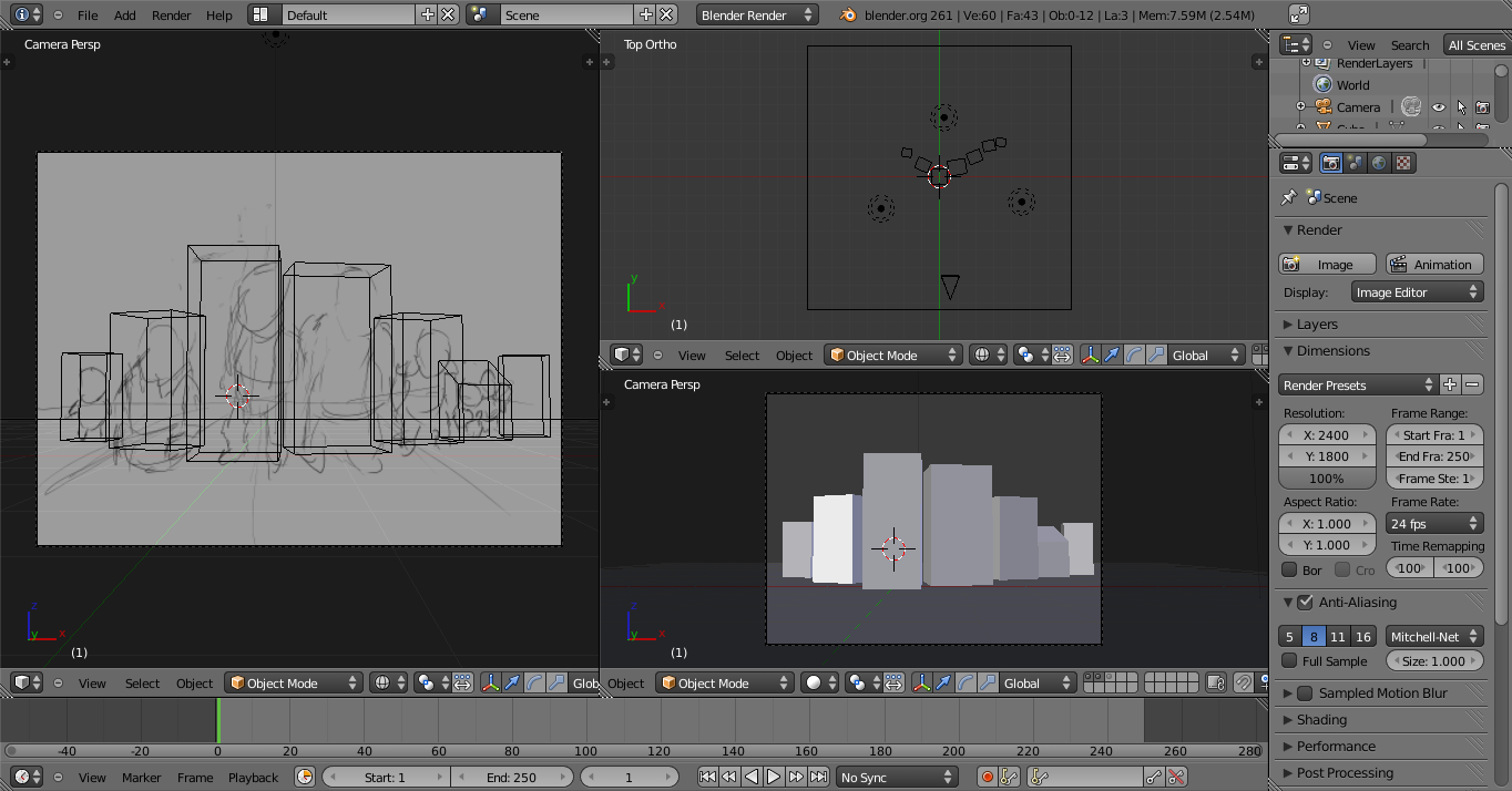
Now that we have that, it's just a simple matter of rendering that, scaling up our canvas on the perspective sketch image to three times what our end result will be (2400x1800 for an 800x600 scene), and adding the blender render as a layer for "guidance". I duplicate the "perspective sketch" layer, move things into place, and refine the sketches a bit so when I do the next draw-over it'll be a bit clearer where things go.

So now we have that, but the outlines are nowhere near what we want here; this is just guidance stuff still. I create a new layer to create another sketch with more details. At this point my desktop looks a bit like this:
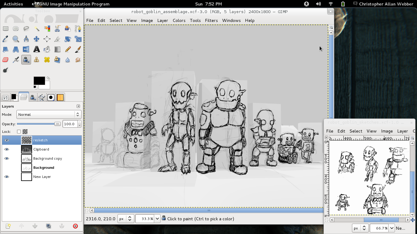
At this point the details are shaping up pretty nicely. However, the middle-left character still looks a bit rough comparatively. So I do three things: make a new layer to draw final outlines over the sketchy but mostly correctly shaped outline ones, make a layer to block in color, and make a layer to go under that which I just paint white so we don't have accidental transparency in spots (I use a pressure sensitive pen and like a bit of the painterliness that comes from using an opacity-varying brush).

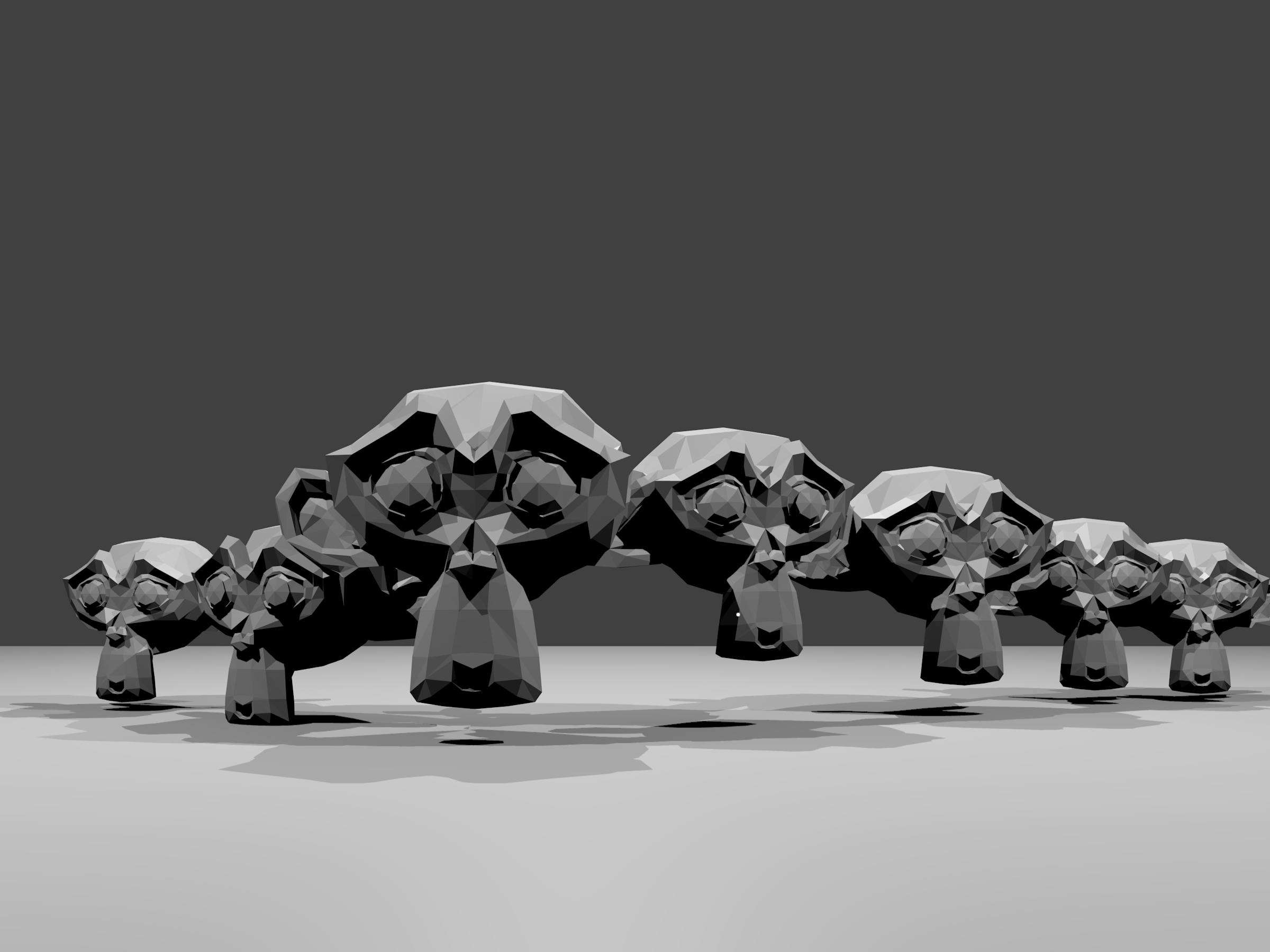
Once that's done, it's time to start shading things in (at this point we have colors, but they're pretty flat). Only one thing: I'd like to be able to have reasonably accurate ideas of where the shading could be. Luckily we already have a Blender scene set up for this, so I swap out the cubes for Suzanne (the Blender pseudo-mascot monkey) heads:
At this point, we're set to shade things in. Really, my method of shading is pretty lazy... I use a circle brush with the burn/dodge tool in the GIMP and "paint in" shadows and highlights with some cleanups and minor detail with the paintbrush and airbrush. The rest of the work is making the background (I used the plane from the blender scene with a conical gradient to give a bit more shadow moving toward the focal point) and some slight color adjustments with the curve tool. I sketch in the shadows at their feet using the pen tool and the cube scene for guidance, add the text, and I'm done!

So that's pretty much it! If you want to follow around or play with it, feel free to download the source XCF file. (To avoid ambiguity, it's CC BY-SA 3.0.) Not all my artwork is as intensive as this one is, but I'm very pleased with how it came out, anyway. Not bad for someone who doesn't have formal training, amirite?
And now, a minor tangent. One of the biggest joys of MediaGoblin development is really working with the incredible, incredible community of contributors and users we have. I've started a thing called contributor drawings to give thanks to people who have done a lot for the project. Sadly, I'm pretty slow at getting them done. But I was pretty pleased with the way this artwork came out... indeed, I tend to think it's some of the best artwork I've ever done. So now I want to take the opportunity to dedicate this piece to a particular community member... Jef van Schendel is our lead graphic designer and is responsible for MediaGoblin's primary look and feel. I felt it was appropriate to dedicate the piece I thought was the best of my artwork to the person responsible for MediaGoblin's design (and also the person who started the MediaGoblin release art tradition!) and I'm happy to say that Jef accepted this as his contributor drawing. Thanks for everything you've done, Jef! MediaGoblin wouldn't look nearly as awesome without you.
